Sometimes comparing apples to oranges is useful
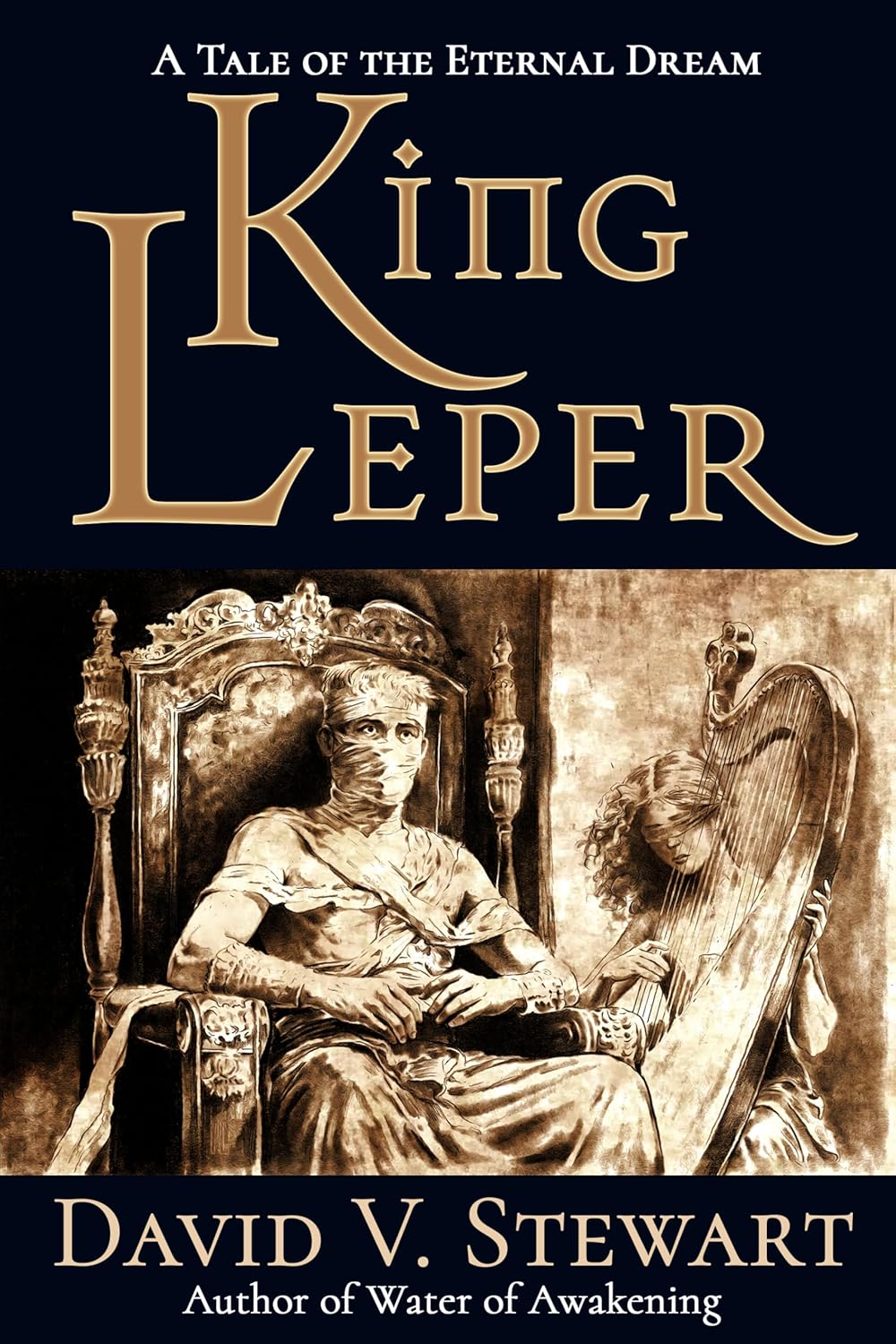
The Amazon edition of King Leper is out now. I’ve already seen a few of my European friends with their copies. If you missed the Kickstarter (or live outside of NA), grab it now, and enjoy some classic fantasy with adventure, romance, and political intrigue:


I love discussing book covers because in the new literary age, authors need to understand marketing as well as writing, and the lessons are not always obvious.
Here we have two covers that are being compared, but they really shouldn’t be because they are different products written for entirely different sets of people, and the covers are using different symbols to communicate information about the products to those diverse market segments.
Neither cover is “bad,” but they could each be bad in the wrong context. In fact, I think they are both great, but are great at very different things.
The first cover is signalling a science fiction action book and is using symbolic language that appeals to that niche. At the top, you have a brand, Warformed: Stormreaver. The book title is in large letters, and the authors (two of them sharing credit) are tiny. I know nothing of this book, its series (or brand area), or any of the authors, but I would not be surprised if their ad copy included something referencing Warhammer. Just look at how similar the design language is:

Notice the similarities?
Meanwhile, the Joe Abercrombie book uses a minimal central illustration, with the text of the book title burning, which is a nice touch. Notice that the skull’s jaw is a crown, a very subtle hint that the book might be fantasy, which is reinforced in a small way by the blackletter font at the top. The design, however, is more evocative of horror, which is probably what you are going to get in an Abercrombie book. Joe, an established author, has his name in large type because he is the brand.
And for me, a strong central image with a dark background is a classic look that never goes out of style. It reminds me of some heavy metal album covers like this one:

The Devils cover is designed to signal to readers looking for horror or grimdark fantasy. The Iron Prince cover is going to target Warhammer fans eager for more things to read in that vein.
So, which one do I like better? Which one would entice me to read?
The Abercrombie cover, and it’s not even close. This doesn’t mean the Abercrombie cover is better, but I am much closer to the target audience than the indie book. While I think Warhammer is cool, I have zero interest in reading anything that apes it or is meant to appeal to Warhammer fans. Just like Star Wars, I’m not interested in “brand” books as a reader. That doesn’t mean you won’t like it! It just means it is not for me based on the cover. I’m more interested in things that are original and are fully an author’s personal vision when it comes to novels.
Iron Prince looks like another hyper-marketed indie genre product targeting a micro genre and aping a larger, culturally relevant media franchise. That’s boring to me – sorry. The Devils looks interesting, even though I haven’t liked Joe’s books very much in the past. But you are a different person from me. Tell me what you think!
I am an independent artist and musician. You can get my books by joining my Patreon, and you can listen to my current music on YouTube or buy my albums at BandCamp.


I like The Devil’s more. Some of it is probably that I’m not a big sci-fi reader, but there’s also so much going on with the sci-fi cover. It’s clear enough, and it’s definitely way above the average indie cover. However, even when there’s a lot to it (and I’ve definitely loved some busy covers), I like a certain cleanness and clarity to my covers. Nicholas Kotar’s covers usually hit well for me, as have some classic Gene Wolfe ones. For sci-fi, I’ve liked some older, pulp-era covers, like Princess of Mars, some Leigh Brackett, and one cover I saw for Hyperion. I didn’t finish Hyperion, but the cover helped encourage me to check it out. With the pulp covers, there’s clarity in many of the designs that a lot of people don’t reflect today.
Good article.
I’ve been seeing more cover articles and I love learning by osmosis!
The art on the left entices me more because it promises a cool imaginative fantasy adventure. Cover on the right doesn’t tell me anything about the book or make me excited, but it is what I’d be allowed to read in the public breakroom without feeling embarrassed in front of my coworkers or needing to hide the cover. I’d imagine I wouldn’t read either book for more than a few pages.
If it’s solely on the cover, I like the one on the left more.
One because of it being representative of what is happening in the boom. The other is because I’m just not much of a horror guy.
If it’s a matter of content, what little I’ve read about the books and the description makes me lean towards Warforged, though the Devil’s does have an interesting premise.
My 2 scales.
I think that the article subtly shows a major problem with the indie world, which is the tendency to level out art of different kinds and degrees and apply the same standards to every work.
Helpful, thanks.
The cover is at least as important as the book, IMO. Especially for new authors. It’s really got to pop.
Hey, I’ve read that book! The Iron Prince one is actually more Warframe than Warhammer, with evolving suits of armor/weapons made from stolen alien technology; the cover of the sequel shows the “evolution” off pretty well, since the designs are really close to how everything is described in the book and the armor is noticibly different from cover to cover. I think genre-wise it’s considered litRPG due to the leveling system the armor has, and in any case it shows up a lot in “litRPG/progression fantasy rabbithole” lists right behind Cradle.
I understand the appeal of the simplified cover designs, but I’ll always prefer covers (and genres) that are more lavish with their cover art, especially if it more or less accurately displays characters or scenes from the story. But I’m also additionally biased against the clipart-style ones because trad publishing has overused it over the past decade or more, probably because it’s cheaper to hire a graphic designer than hire both an artist and a designer. So to me, it just looks cheaper, even if it’s competently done design-wise. (Like the burning paper edges of the text on the Abercrombie cover; it’s neat and a cool bit of attention to detail, but the woodcut style clipart detracts from it, in my opinion.)