


Time for something different – some tips on choosing the right colors for art, ad copy, and things like book covers.
Let’s start with some examples of great fantasy art by Kerem Beyit:

Kerem’s proficiencies are many, but one of the reasons his art has such a vivid “pop” and stands out so much is his use of color, specifically limited color range centered on two different (but rarely complementary) colors. Rather than attempting to go for some “realistic” approach to color representation, he distills things down to a few charged areas. The result is really eye catching.
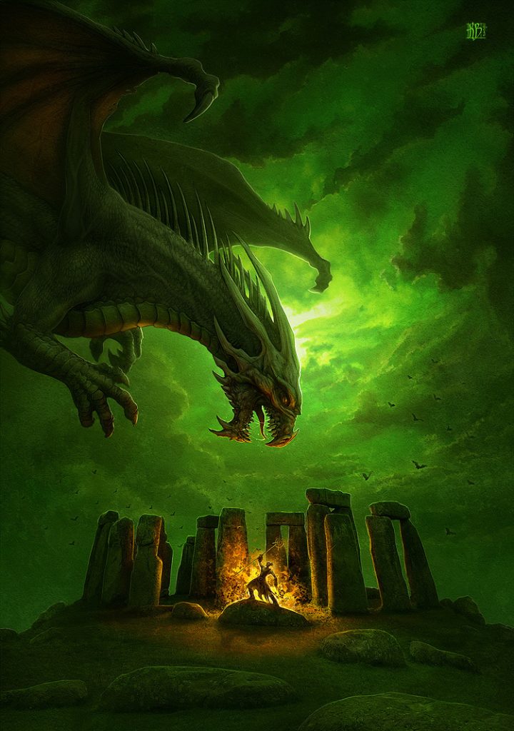
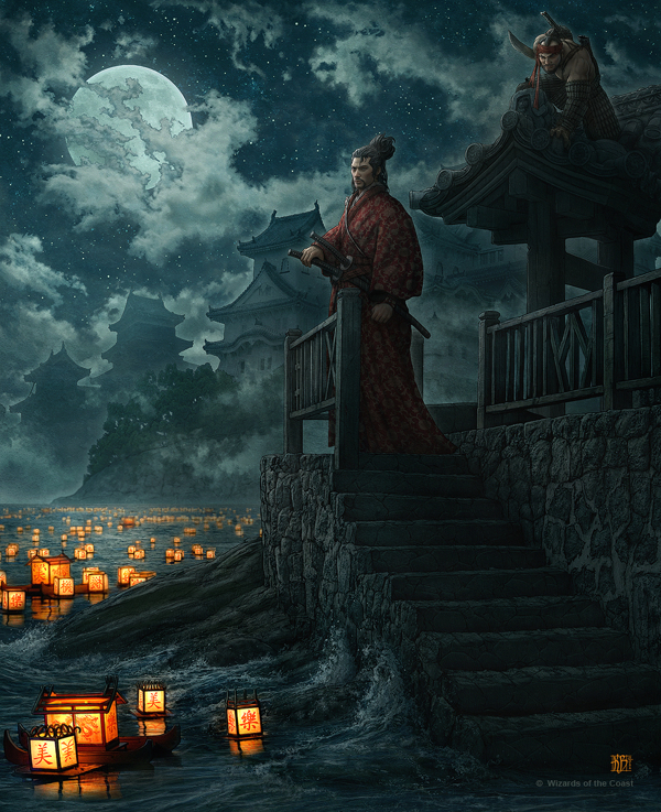
Notice in the first piece, the dragon over the stone circle, there are only two color areas: green and orange. There are several shades/tones of each, and some small yellow transitional places, but it really just comes down to those two colors. The second piece is also green and orange, with the neutral white coloring the dragon and making it really pop off of the green background.
Third piece, with the samurai, might look like it has a wider range, but look closer. Most of the painting is in a neutral tone of blue, very desaturated and coming off as grey, that allows the other colors to stand out. Those other colors are orange and red, with some skin tones on the models. Even their hair is grey.
This approach to color in the total composition is indeed what makes his images so good for album and book covers:

This one uses purple and orange, almost to the complementary yellow, which is quite vivid.
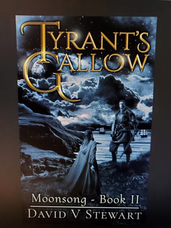
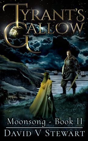
Of course, I licensed one of his images for one of my own books:
The yellow text tends to work well with green, I think. General color grading moved her hair slightly to orange – the original was a little more red, but still, we’re talking a limited color range, in two main areas.
As a cover designer, this is something that is definitely worth considering, and something most new authors (and new designers) frequently miss when putting together a new book cover.
LESS IS MORE at least when it comes to color.
So what I do when I am designing a cover, especially when creating a composite of multiple images (what I usually do), I do all the early compositing and design in a monotone. Here is an example from an upcoming book:
I already designed the title text awhile back, so I kept that in gold (which will be one of my main two colors). In a single color range, it’s really easy to see how things go together, as well as if the subjects actually stand out from the background in the composition, or get lost. Try it!
If I remove the colorize filter (notice it was actually a shade of blue, not grey), it becomes a total mess:
That one should be heading straight over the the bad book cover website. This is what I looks like once I color everything:
It looks a LOT better. There are still some things I will do before I set up the pre-order, but you should get the idea in the final image. In fact, I probably didn’t need to do such a complicated composite – a simpler image would have worked just fine with the same approach to coloring, but I had this sort of thing in my mind, so I did it. Consider how simple the Needle Ash cover is:
Just a guy over a tree background – everything green and red, with some yellow letters to go with it all. Otherwise, neutral tones. Here’s an even simpler cover:
Blue, burgundy, Yellow. Very colorful, but notice how each color area is limited in hue – the range comes from mixing white and black.
Lastly, there is this one:
Almost no color at all! The “grey” of the image is actually a very desaturated teal, with the lighting in the background providing a hint of something lively in the yellow and pink areas. The teal shades help the title look more like silver, a true grey.
Some quick tips
In summary:
- Use a limited number of color areas – two, possibly three. Use fairly narrow ranges for those colors (in the digital space, use the same hue, but mix it with white and black to get your light/dark ranges)
- Use colors that are one off from complementary color. For instance, orange and blue are complementary; use blue and yellow, or blue and red instead for a strong effect that isn’t as jarring as the complementary set.
- Use contrast between neutral tones and vivid colors, or between bright whites and darker colors.
Make it pop with color!
I also write nonfiction. If you are an author, artist, or musician and have difficulty establishing a good workflow or bringing your dream projects to fruition, consider reading the Keys to Prolific Creativity: