


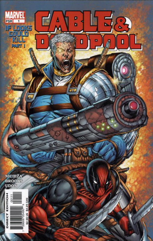
Rob Liefeld sells comics.
His detractors are often at a loss to explain why, and while Rob is one of the most lambasted artists in comics, he continues to be successful. I got this impressive cover off of an extensive article dedicated to bashing Rob.
Rob sells comics because he sells style.
His images are not intended to be realistic, but grotesque. They stand out and make you pay attention. The heroes are bigger. The guns are bigger. The swords are swordier. It’s something other artists could learn from.
At the same time, though, the complaint regarding technical issues is valid due to the presentation and the chosen medium that Rob operates in. The comics are supposed to evoke a realistic image, so while “distorted reality” is what sells, you can quickly end up in an “uncanny valley” where the flaws are distracting and make the character look alien rather than attractive.
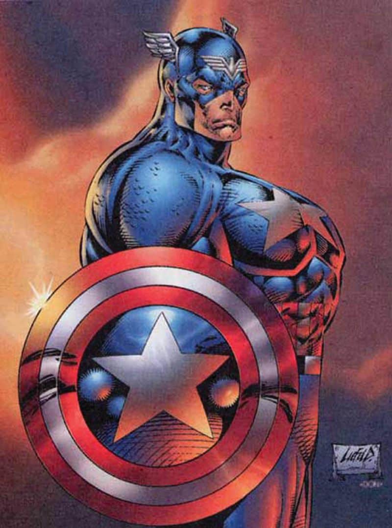
I don’t want to take too much away from Rob, because honestly most of his contemporaries, if technically better, are still able to produce this uncanny valley effect consistently. My friend, Jesse White, has convinced me that it is because they are operating in a space that was developed by technical experts, like John Buscema, and they copied the style of him and his contemporaries without learning the techniques that make illustration look like an accurate representation. The result is something that can look so out-of-bounds in the space that it becomes silly.
You can go the other way, and avoid the realistic comparison, working completely within the realm of style, or adopting what I call a stylized aesthetic.
Stylized aesthetics are what dominates cartoons, especially those intended for children. The image is much more of an abstraction, an impression, of the object being displayed rather than an accurate representation of something that could be real.
The focus in a cartoon is on the gesture, or the emotional intent, rather than the technical aspects. If you look at something like Japanese anime or manga styles, you get a certain kind of stylization, primarily in the face.
The emphasis on over-large eyes and smaller facial features has become a style unto itself, but it is not without purpose. Eyes communicate a large degree of emotion, so sizing them up telegraphs certain feelings with extreme efficiency. Likewise sizing down the mouth makes mouth gestures, when you use them, more pronounced. It also tends to give characters a sense of “cuteness” all around, which can be appealing in its own right.

Once you move into the realm of style, you are working in a space where technical distortions are not presented to the viewer in a way that they are going to readily object to. Some manga and anime use very accurate bodies, which creates interesting space between the realms of realism and style. Generally, though, proportions can be off as long as they are working toward the intent of the piece.
However, just because you are in the realm of style, that does NOT mean that aesthetics become arbitrary or unimportant. Something can be quite ugly while avoiding the realistic art space. Case and point, Thundercats roar, a skinsuit abomination of a popular 80s cartoon animated in Japan.

This is not good. The characters are not trying to look realistic, but by God they look disgusting. The formless flappy hands, squishy arms, the stray marks to stand in for detail, the square head contrasted with… I don’t know what the character on the right is supposed to be, honestly. It’s unintentionally androgynous.
So the lesson is, style may not ask you to consider technical details, but that doesn’t excuse ugliness. Operating out-of-bounds of reality doesn’t mean you can ignore proportions entirely, avoid using proper color techniques, or get a free pass on distortion of space or proportion.
Just to make my point clearer, and because I like to plug him, take a look at this page Jesse shared recently:

The forms are accurate and detailed, but there is a close-up of the face. We need that face large and in detail to fully appreciate the character’s emotion. You don’t need to go into the stylized space to convey emotions at all, but you do have to have both the technical knowledge to draw a face as well as the experience in the medium to know that you need a close-up to really get that detail across.